Learn with Us
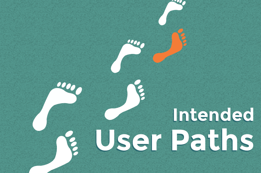
Intended User Paths: Movement in Website Design
October 21, 2015
By Team Hello

Moving visitors through your website is important. Unless your aim is to create an endless pool of information like Wikipedia or Facebook, at some point, there will be a task you want a user to complete to get additional value from you.
One of the ways we help clients model this process is with Intended User Paths.
Mapping the Ideal Route for your visitors
Whether we’re working with a client on Inbound Marketing (which makes heavy use of the Buyer’s Journey), or simply creating a checkout process for an eCommerce website, knowing the steps a visitor needs to take to get from their first impression of the website to a successful transaction is important.
The Buyer’s Journey suggests that each person moves through three stages during a buying process; Awareness of a brand or solution, Consideration of the available options, and the Decision to use or purchase a solution. This process can require many returns to your website, often from different sources. Each visit should offer the visitor options appropriate to their place within the Buyer’s Journey – and should be treated as a single, discrete path you take that visitor through.
If you’re website’s pages are successful, they’ll have enough information on them that a visitor can feel they’re getting value – and enough cues that there’s more value waiting for them by taking an action.
The process, at its most basic, is the same for every site; Discovery leads to initial Value, and through Guidance ends with a Conversion.

Discovery – where your visitors come from
This part of the chain is very often the top priority for online marketing discussions. We know how we want to get visitors to get to our websites; they’ll find us in search, or in social media – we’ll serve them advertisements, and they’ll click through those ads, or type the URL in from a brochure or business card we’ve given them.
Once they’ve arrived, however, we need to keep working.
Value – showing someone they’ve made the right choice coming to you
This may seem easy at first, but it often becomes the biggest hassle.
Why did someone come to your website? Were they shown a link with some context by a friend? Were they actively searching for a particular term and happened across your site? Did they get your business card six months ago and finally, just now, begin to research?
It’s important to develop content that makes sense for as many of these questions as possible.
Business cards usually have your home page on them – so your home page’s content benefits from being very general.
Search terms tend to surface pages with content that the engine believes is relevant, so even if it’s a deep page or an old blog post, making sure the content is self-contained and explains its own purpose well matters.
No matter the reason someone happened across your website, your content should present value up front, or guide people very clearly to where the value exists.
Guidance – hand holding for your visitors
Not every instance of proper user guidance on your website will be an obvious Call to Action, form, or registration page – they can’t be, otherwise you’ll come off very heavy handed.
Links within text can be a subtle way to guide your users around your website, by providing additional resources or context. Pagination works the same way; if your visitor is in a longer article, or working through detailed product and service offerings, each page can build on the last naturally.
Even the placement of elements on your page helps users understand where it’s worth interrupting their current actions to do something new. Comment forms nearly always exist at the end of a blog post, for example, as do Call to Action segments.
Conversion – where sales, subscriptions, and other commitments happen
Not all calls to action lead into a purchase – but eventually, if it’s the purpose of your website, some must. When a user commits to buying something from you, requesting information or a quote, or completes an action where an exchange of information is made – that’s a conversion.
Once this process has happened, you’ll have some form of value from your visitors. Contact information, money, a new user account registration – this value comes in a lot of forms. It’s the end goal of most of your user’s paths – where you want them to end up.
Any visits that don’t end with some kind of conversion we call Abandoned visits. Even if the visitor hasn’t begun a shopping cart process, if they’ve viewed a product, or a landing page, and failed to do the actions required to pass that gate, something’s mismatched.
Abandonments happen for a lot of reasons. Technical faults, visitors not liking or reconsidering their choice in beginning a process, external interruptions. All of those things provide us data we can use to smooth out the entire journey – from Entrance through Conversion – and improve our success.
Examples of User Paths
Prototyping the way users may move through your website can reveal a lot about whether or not your website’s design is standing up to the right kinds of movement patterns. The trick here is to consider where the visitor is coming from, and what they may want to get in terms of value.
Note: Mind mapping software, or any sort of chart creation program, is a huge boon to this process. Even a whiteboard, or a flat surface you can arrange some Post-It style notes on will help. The important part is just getting the information down. We use whiteboards and tools like Lovely Charts for this, because they make the process very quick indeed.
A social visitor who found you by personal interest.
blog post value > guide with links, comments, CTAs > subscription primary conversion” height=”212″ src=”http://cdn2.hubspot.net/hubfs/510091/blog-files/userpath-social.png” style=”width: 754px;” title=”User Path: Social entrance > blog post value > guide with links, comments, CTAs > subscription primary conversion” width=”754″>
Consider how your user has found you. In this case, someone’s happened across an update (a tweet that’s been shared, a Facebook post, or Google+ post perhaps) and has become curious. They decide to read the blog post attached do the shared update… But they don’t really need anything you offer right now. How can you encourage this visitor to maintain a relationship with you until they do need something you offer? The shortest path to that marker of support is the key here.
A contact from a trade show, following up on your brochure
product/service page value > general CTAs or contact us text > newsletter conversion” height=”303″ src=”http://cdn2.hubspot.net/hubfs/510091/blog-files/userpath-direct.png” style=”width: 754px;” title=”User Path: Direct entrance > product/service page value > general CTAs or contact us text > newsletter conversion” width=”754″>
If you spend any kind of time at trade shows, you’ll know how often this happens; you hand out brochures, business cards, and demo materials… And probably never hear from the people you spoke with again. Why?
Direct traffic is difficult to track without some sort of special URL or code, sure – but more often, a lack of Call to Action or ease of communication is a bigger problem. How easy is it for someone who’s had a demo, or who has read a brochure, to get in touch with you? How much friction can you remove from this process?
A business owner, who needs a product like yours
product/service page value > buy/contact cues > Contact/quote/purchase systems” height=”302″ src=”http://cdn2.hubspot.net/hubfs/510091/blog-files/userpath-search.png” style=”width: 754px;” title=”User Path: Search entrance > product/service page value > buy/contact cues > Contact/quote/purchase systems” width=”754″>
This is not an impulse buy, it’s a well-considered purchase, by someone who knows what they need – and, thanks to the wonders of search, has found your website for precisely the right keyword. What next? If someone’s decided on your product or services, how quickly and painlessly can they hand you their money? Or, if they’re still considering, how easily can they contact you with directed questions, to keep moving through your sales funnel?
This model is a jumping-off point for creating new website content.
Once you understand how a visitor needs to move through your pages, it’s easier to decide which pages need links, where natural chances to ask for sales can occur, and you can begin monitoring your website’s analytics for signs you’ve set things up in a valuable order.
Next week, we’ll be talking about how to organize your content within this structure, and how it helps make growth driven website design more approachable.

![]()
Source: Hello BLOG